
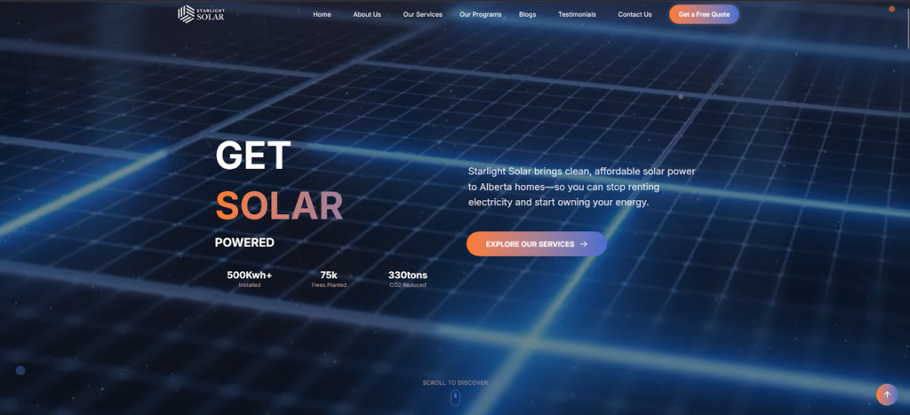
Case Study: Starlight Solar Website Revamp
Making the website clearer, more engaging, and easier for users to take action.
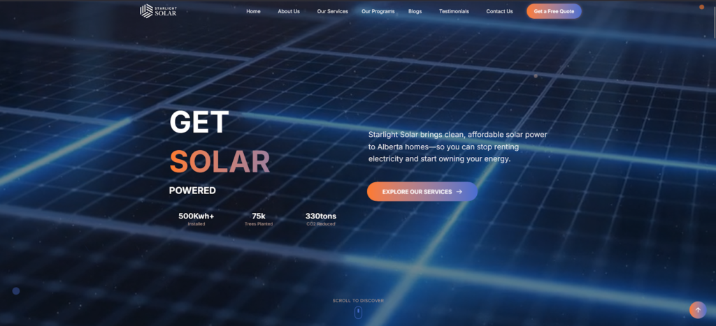
The Problem
Starlight Solar already had a strong service offering, but their website wasn’t doing full justice to it.
- The layout felt basic
- Information was not easy to scan
- Landing pages were not guiding users clearly
- Visuals didn’t reflect the quality of their work
Visitors had to put in effort to understand what Starlight Solar does and what the next step should be.
What We Did
We focused on clarity first, design second.
1. Improved Website Structure
- Reorganized pages so information flows logically
- Made services, benefits, and contact options easier to find
- Reduced clutter and unnecessary sections
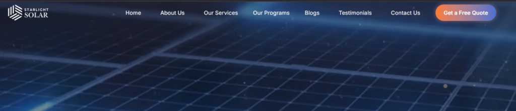
2. Better Landing Pages
- Clear headlines explaining what Starlight Solar offers
- Simple content that answers common homeowner questions
- Strong but natural call-to-action buttons (Get a Quote, Contact Us)
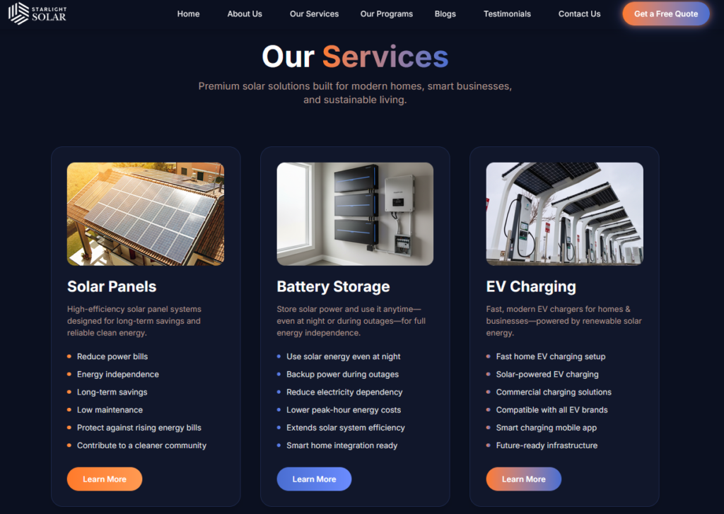
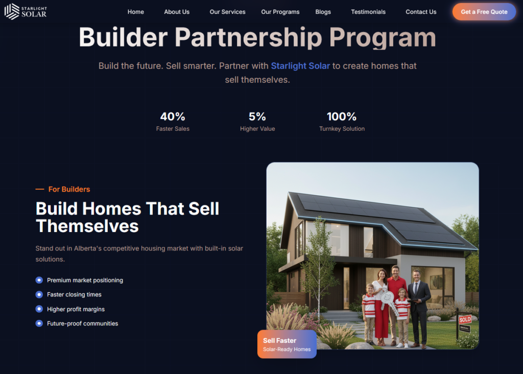
3. More Engaging Design
- Updated the overall look to feel more modern and professional
- Added relevant images to support the content
- Improved spacing, readability, and visual balance
The goal was not to “over-design” but to make the site comfortable and trustworthy.
4. Clear Information, Not Overwhelming Content
- Simplified explanations around solar energy
- Focused on benefits instead of technical overload
- Made the site easy to understand even for first-time visitors
The Impact
- Website feels more interactive and user-friendly
- Visitors can quickly understand services and value
- Navigation is smoother and more intuitive
- Better first impression for potential customers
This created a stronger foundation for lead generation, even without aggressive sales messaging.
Final Words
We helped Starlight Solar turn their website into a clear, clean, and approachable digital experience that supports their business instead of confusing users.